Do It Best Motor Oil Brand Redesign
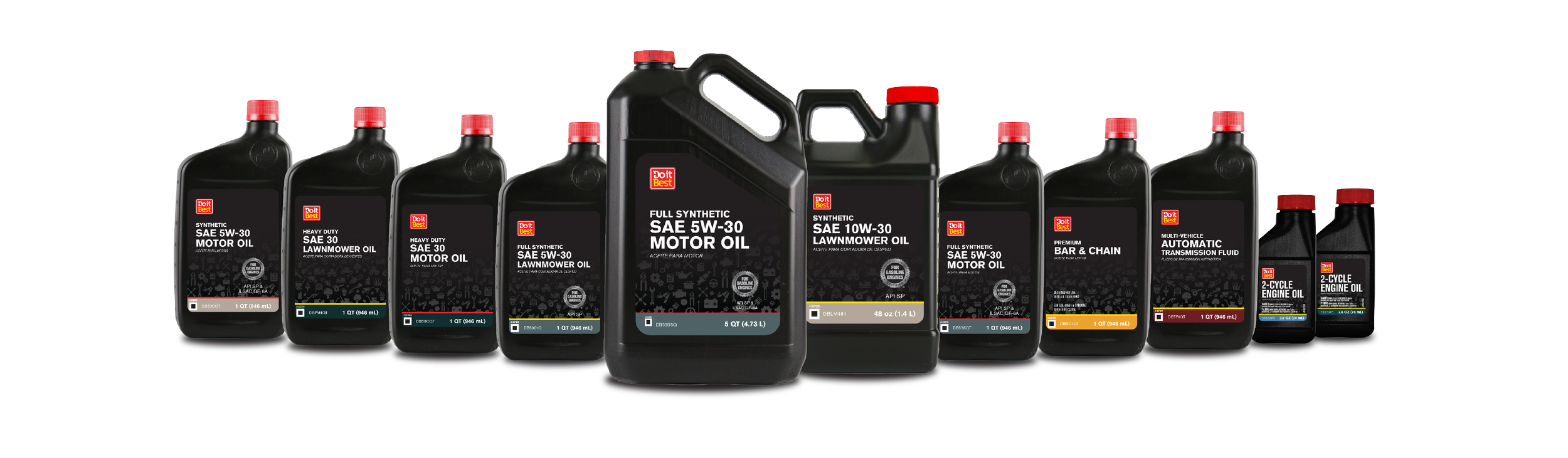
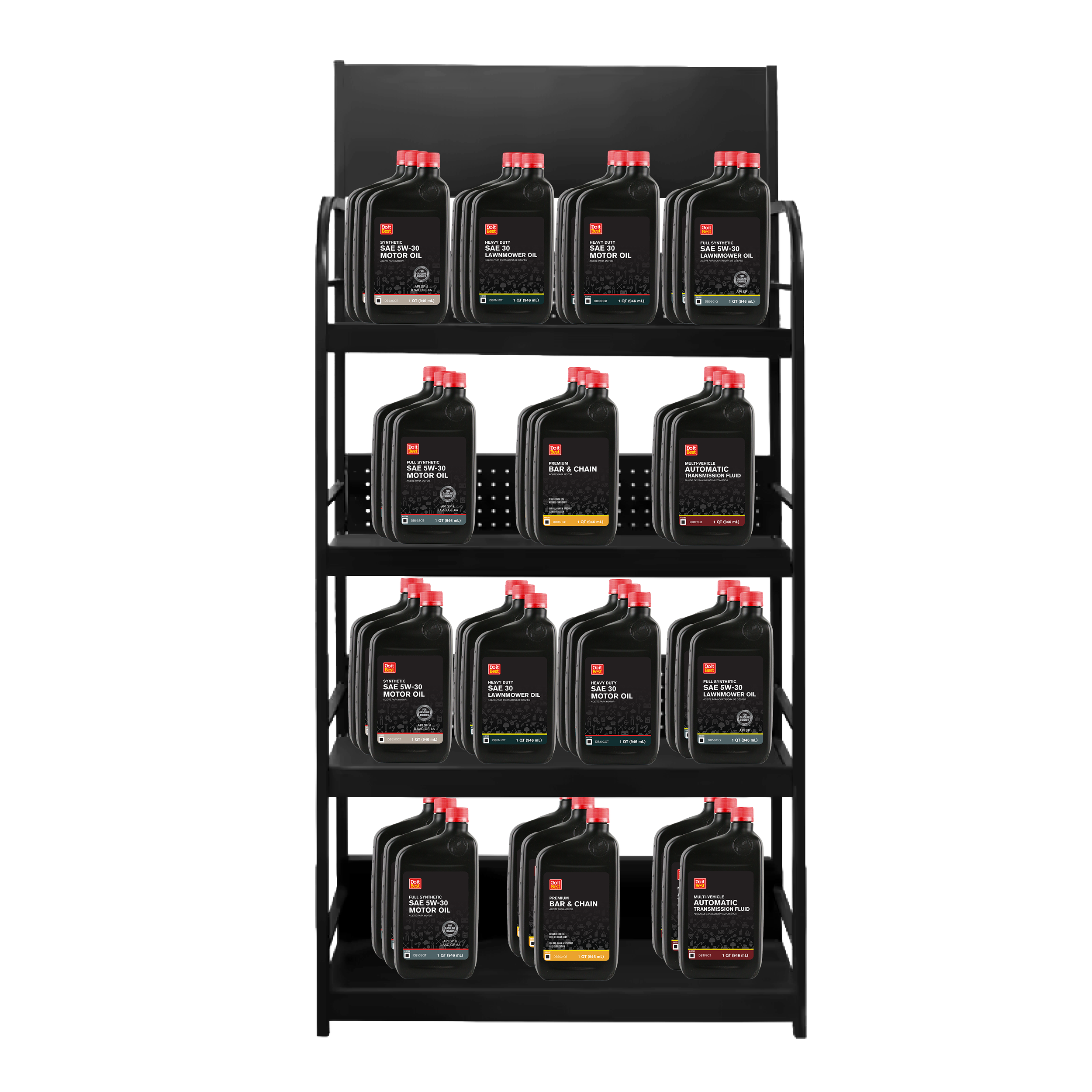
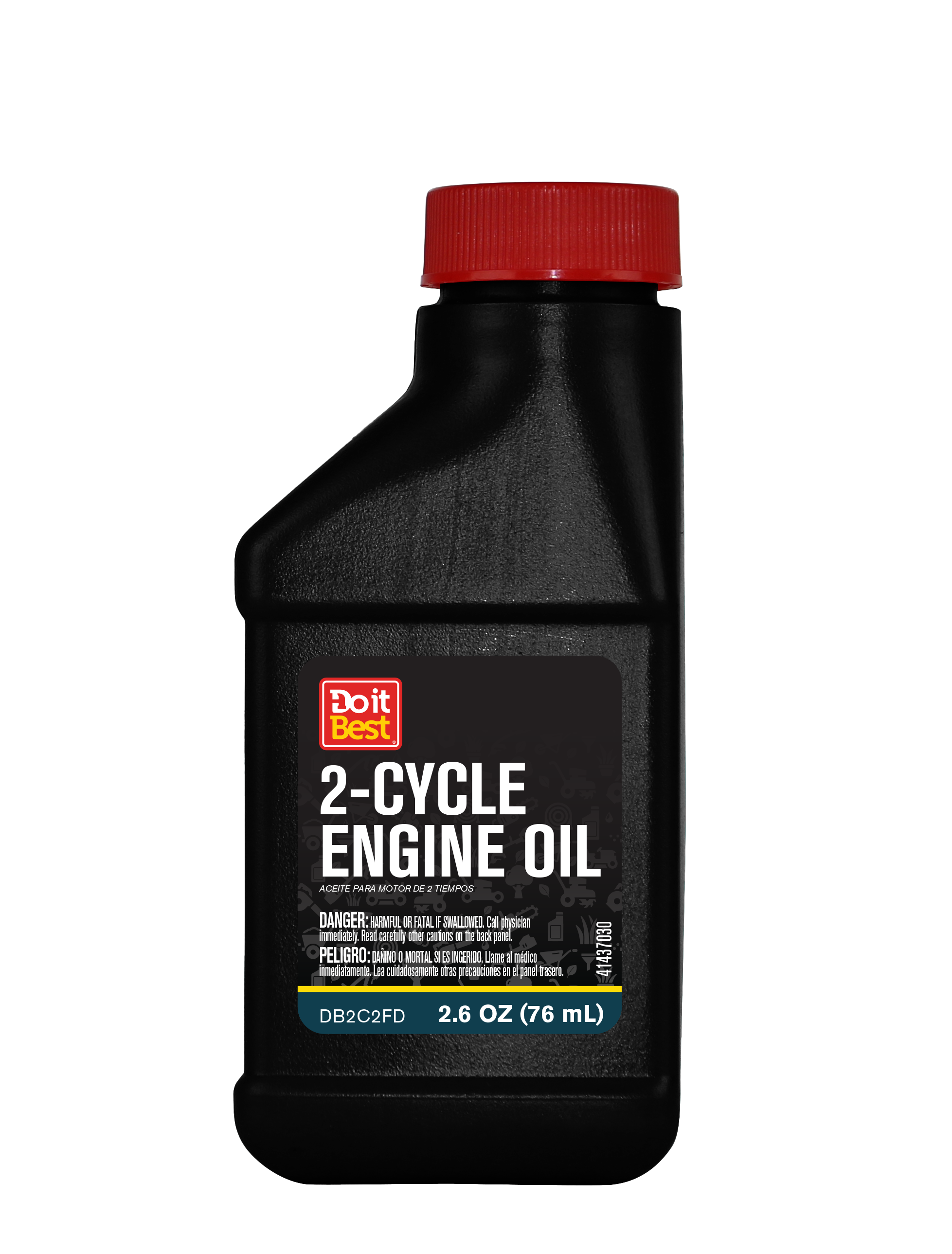
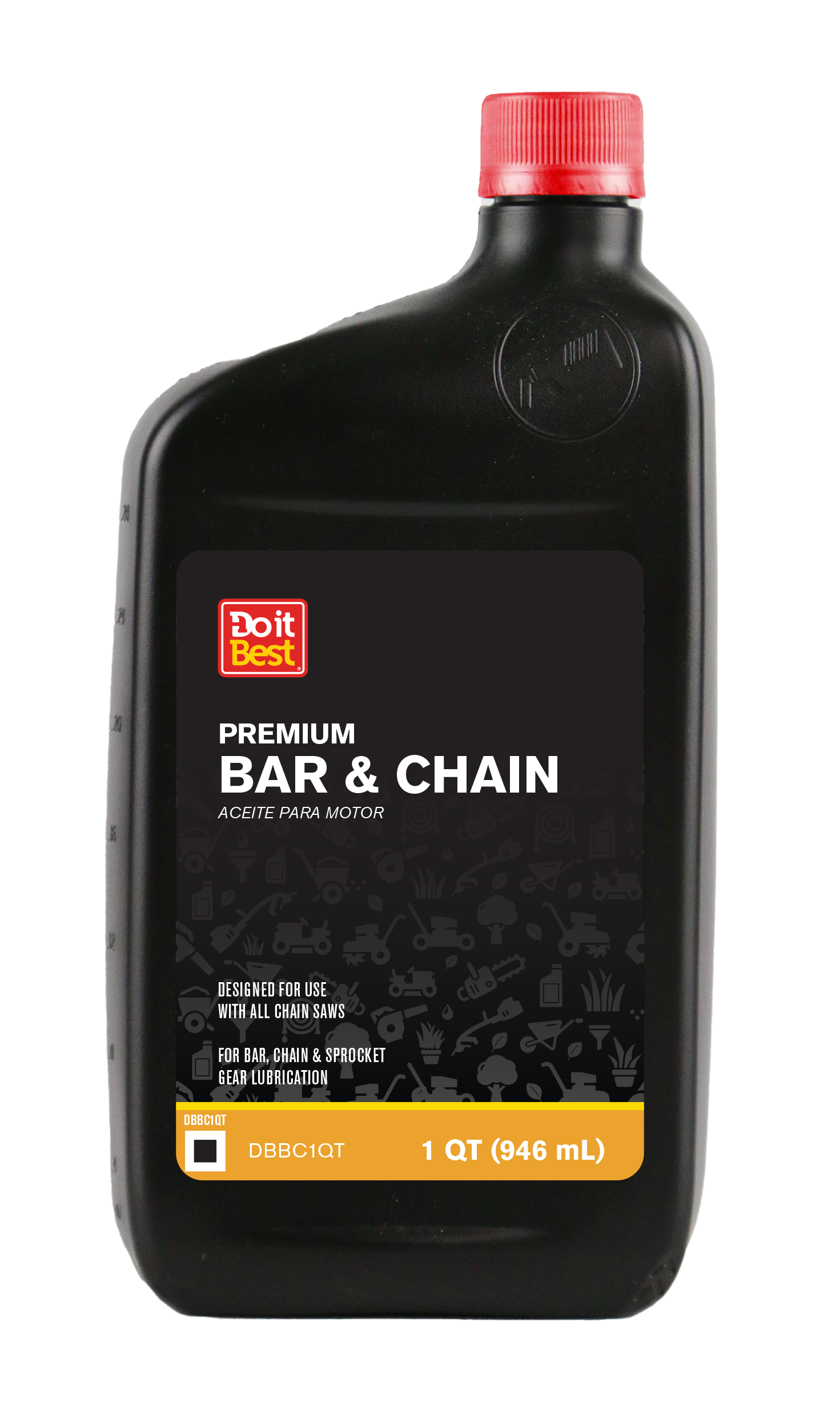
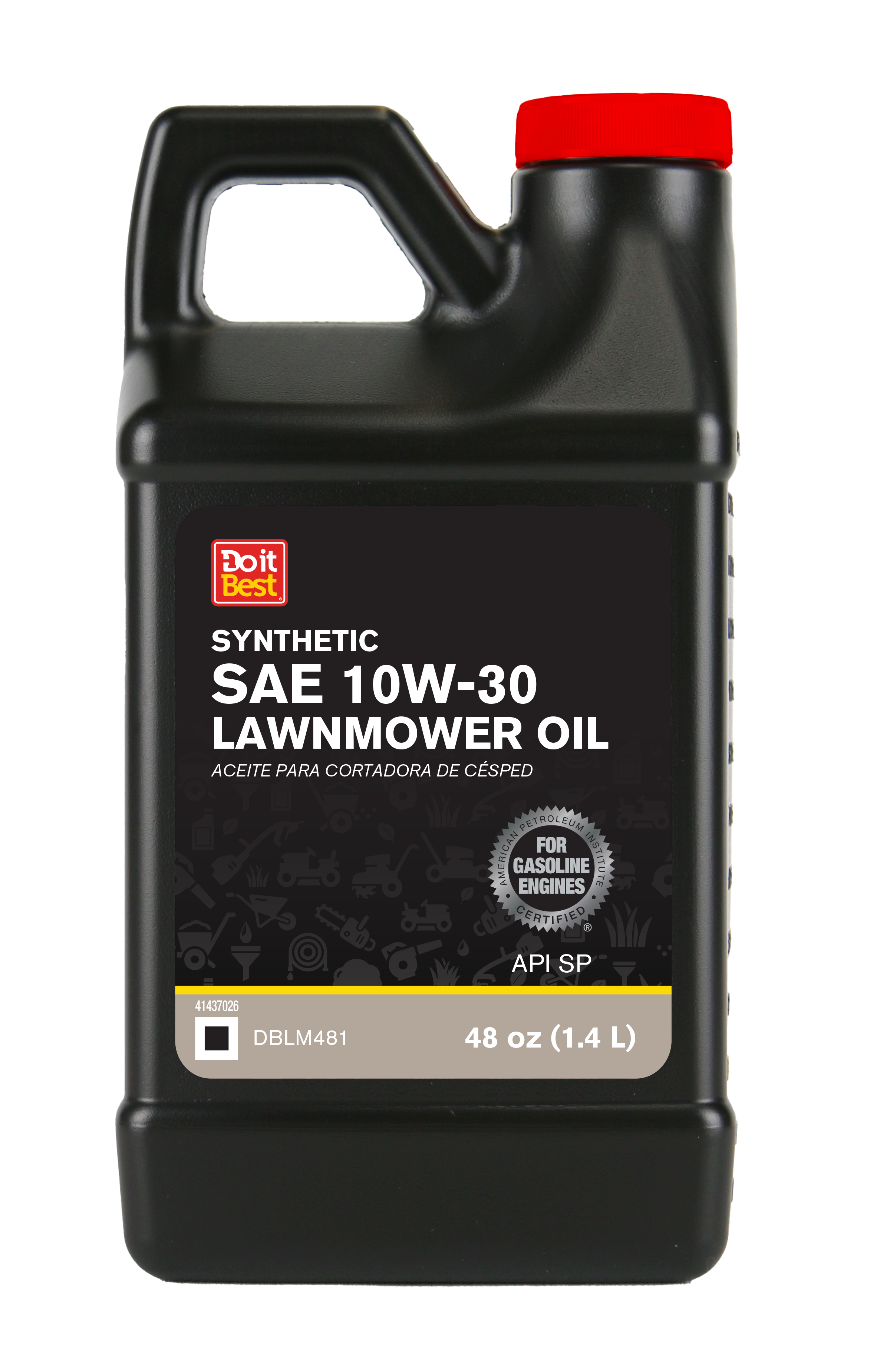
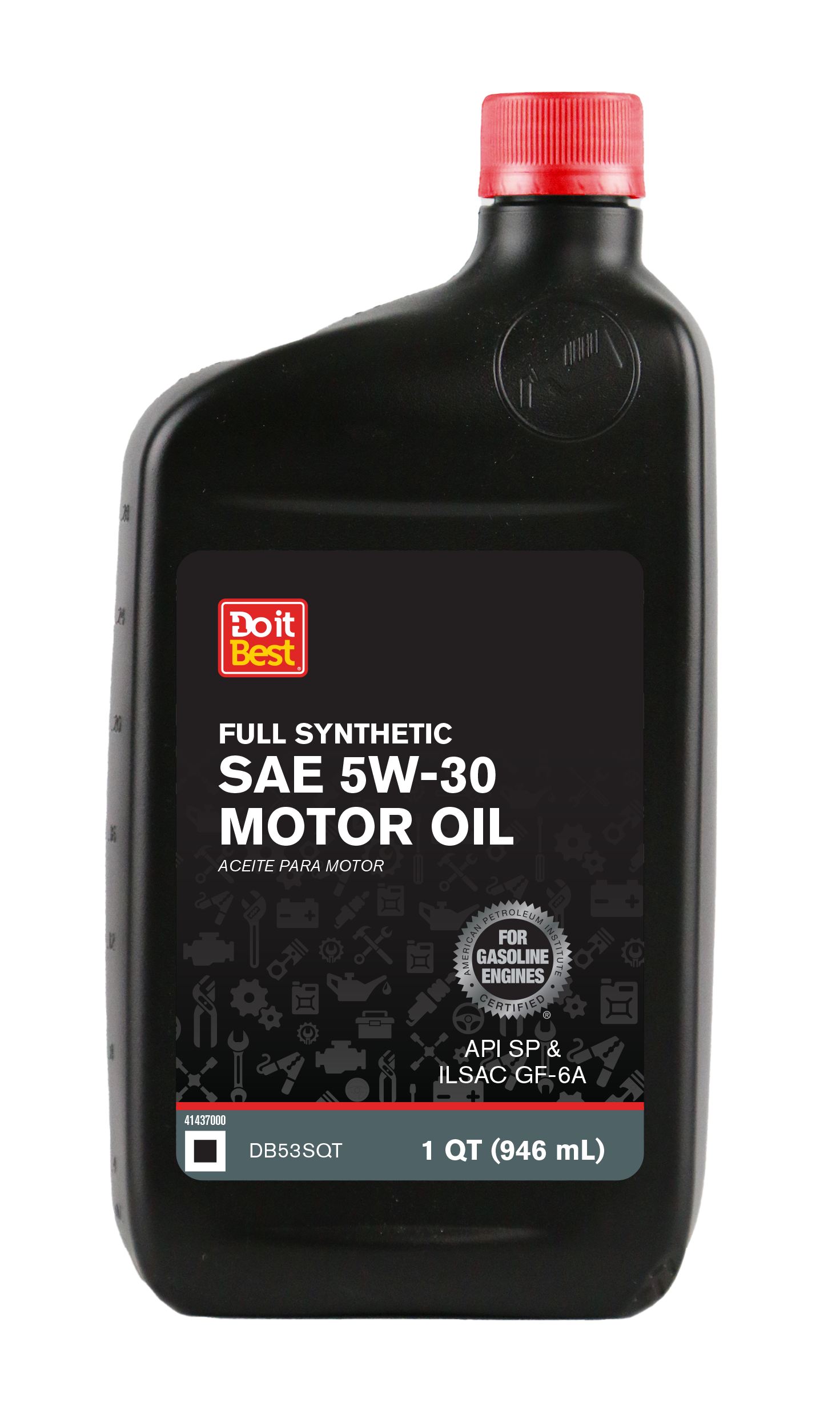
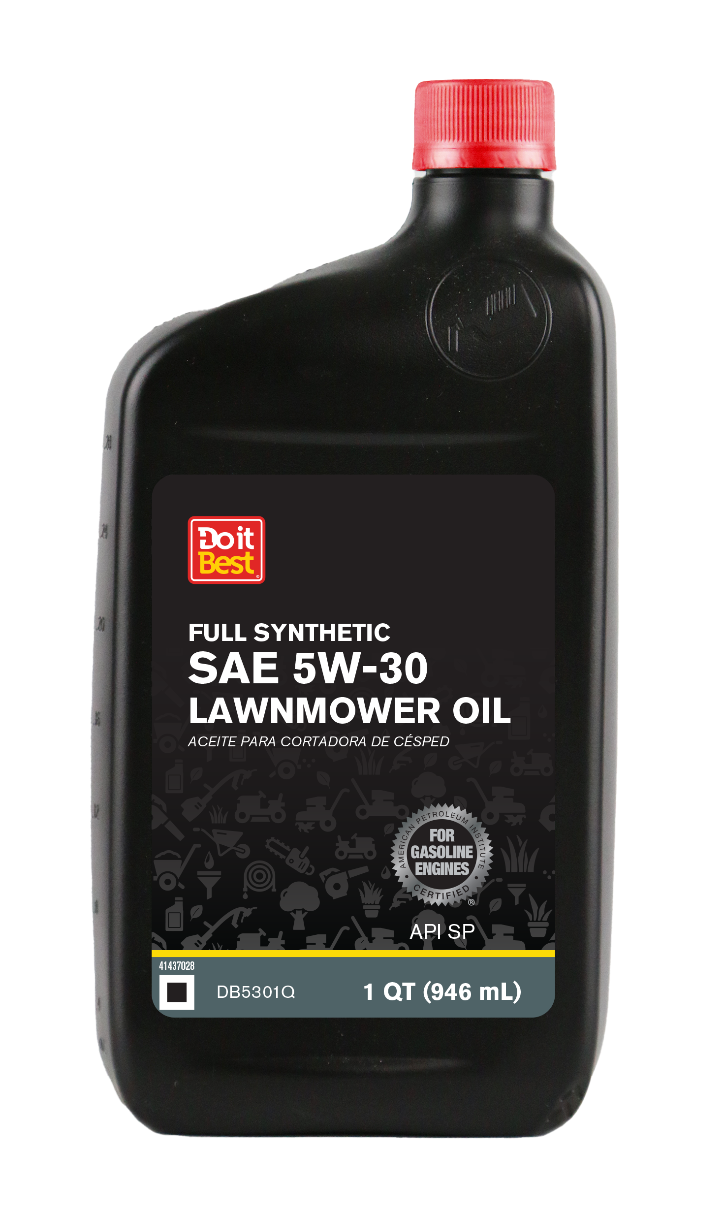
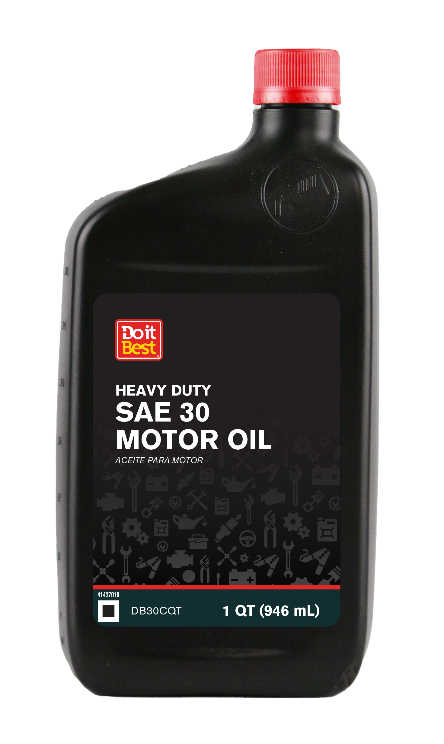
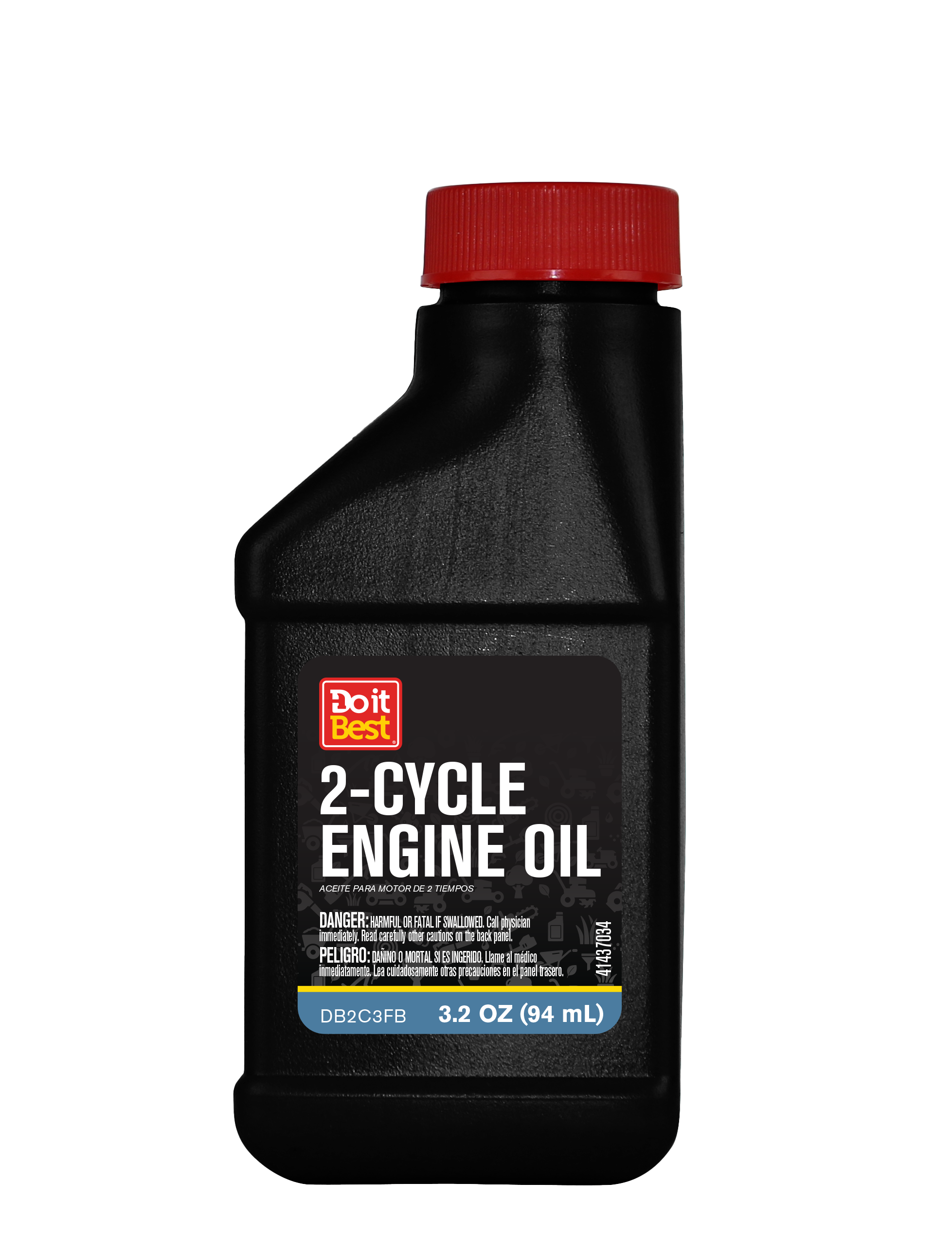
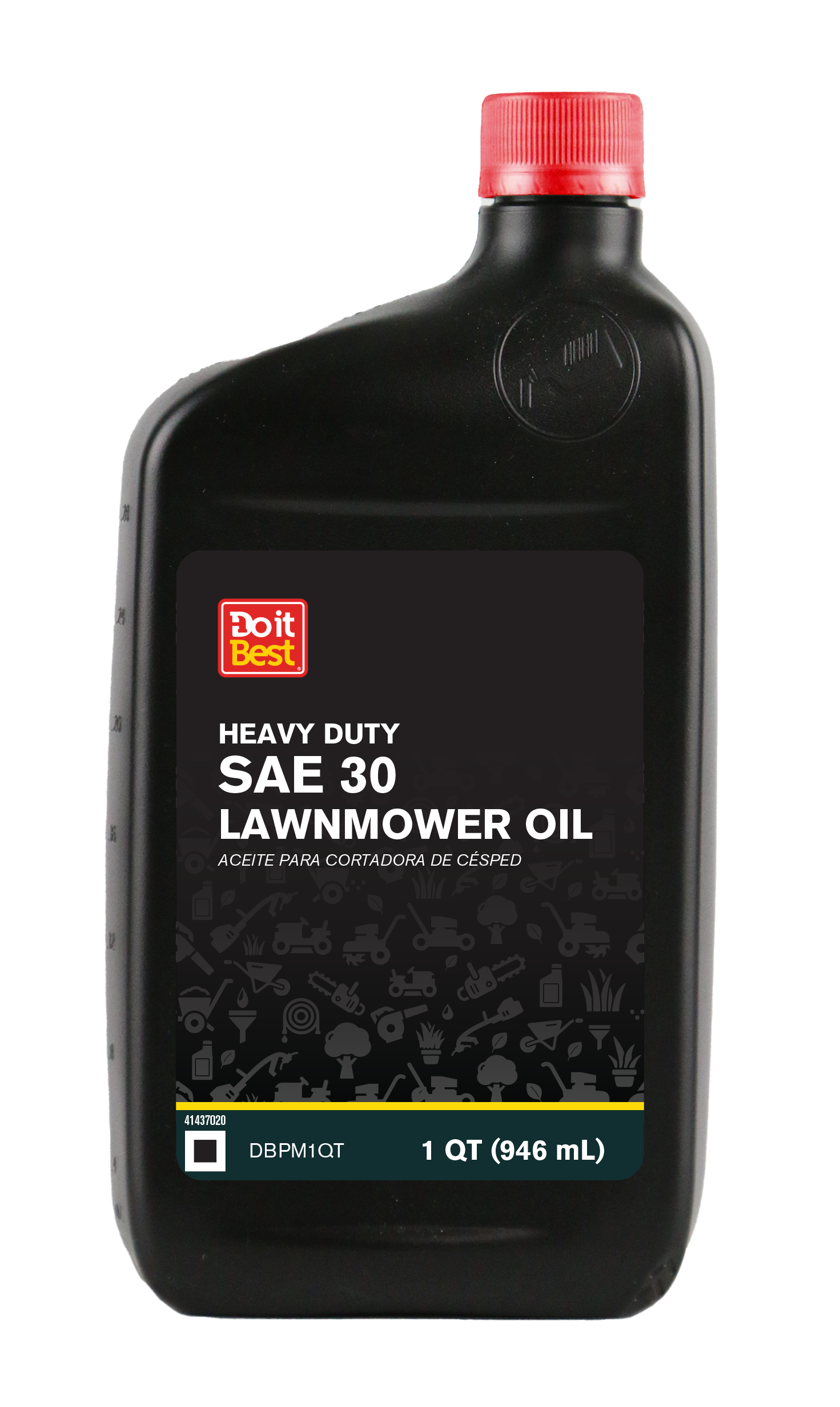
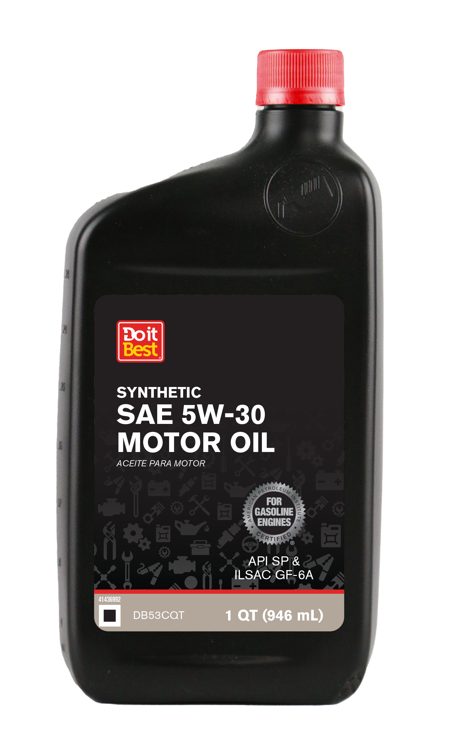
When reimagining the motor oil packaging system for Do It Best, I began by identifying a key user challenge: customers relied heavily on small viscosity numbers to differentiate products, creating confusion on the shelf. The existing design lacked a clear visual hierarchy and did little to guide quick comparisons. My goal was to create a streamlined system that simplified the buying experience without compromising brand integrity.
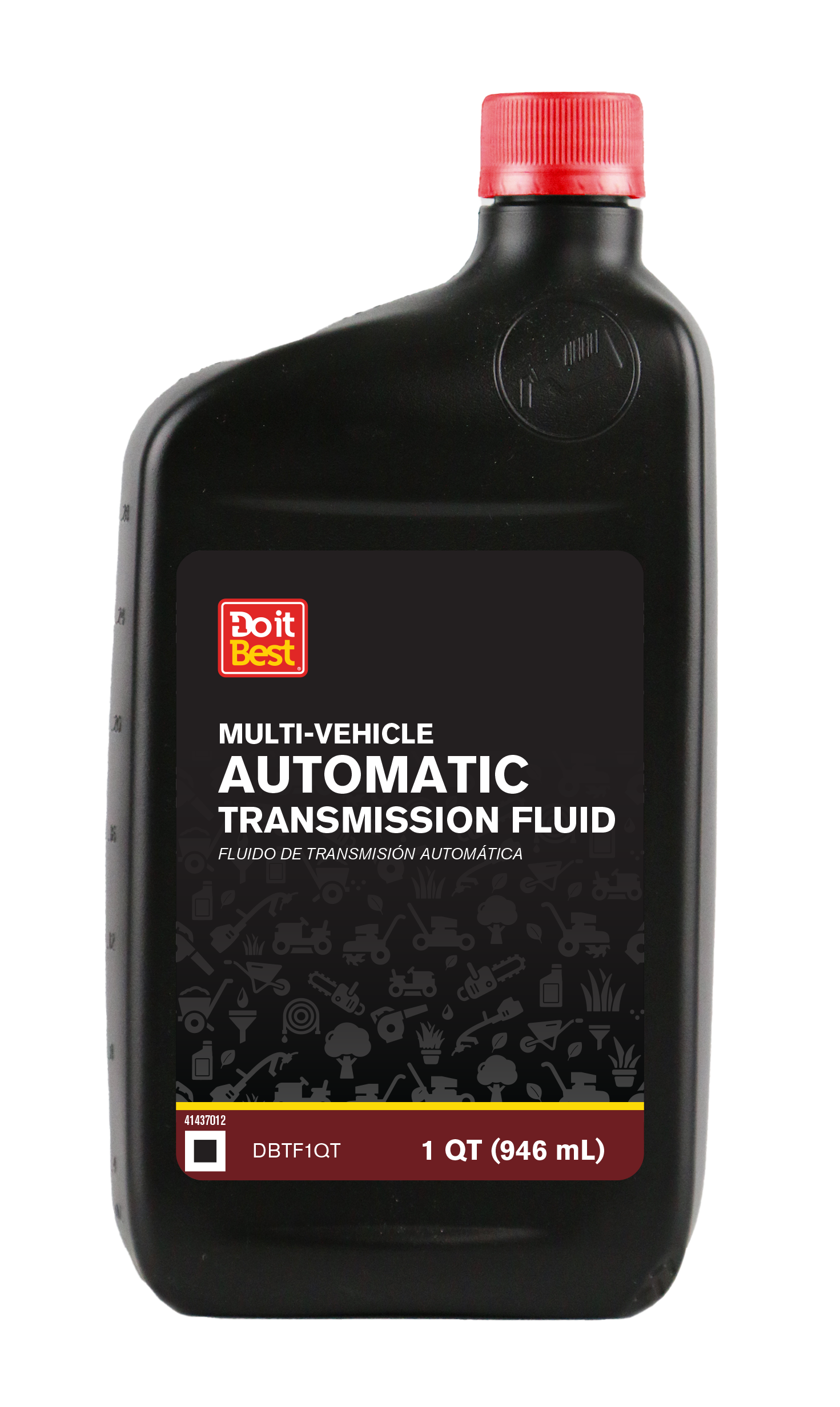
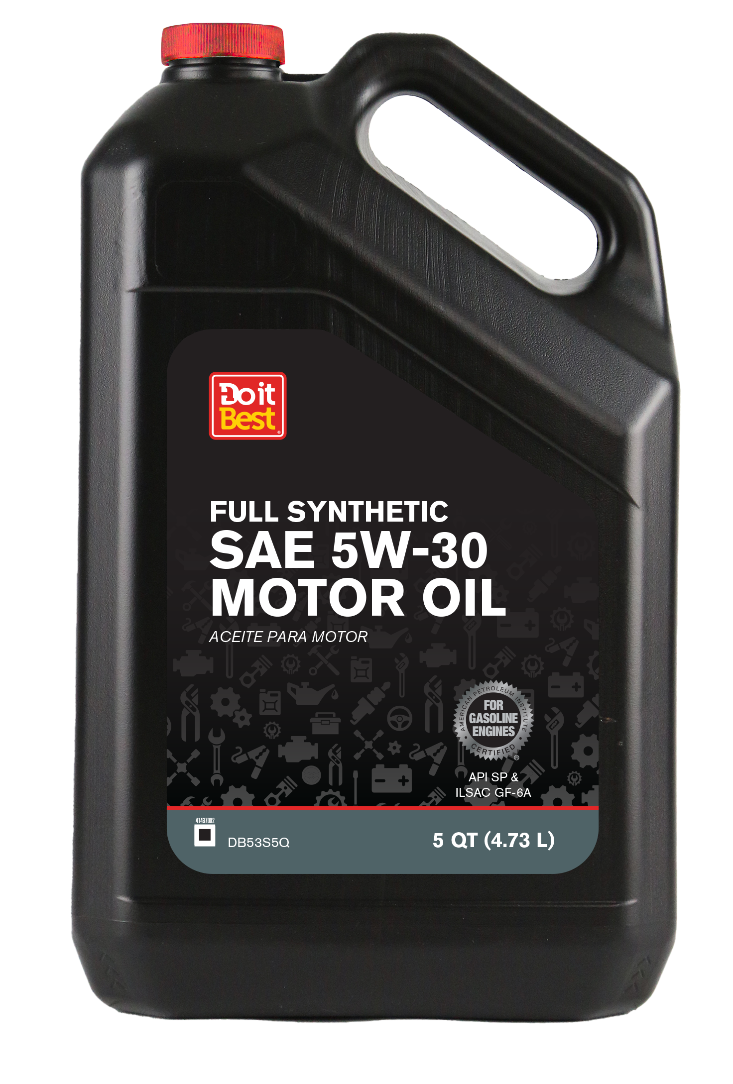
I developed a minimalist design framework built on strong typographic hierarchy, reduced visual noise, and a structured grid system to ensure consistency across SKUs. The core innovation was a bold color strategy that assigned a distinct color to each motor oil viscosity. This allowed customers to instantly differentiate between grades that were synthetic blend or full synthetic without relying solely on small text. The color system extended across labels, caps, and secondary packaging elements to reinforce recognition from multiple viewing angles.
By simplifying graphic elements and emphasizing clarity, the redesign improved shelf impact, strengthened product segmentation, and enhanced overall usability for both DIY consumers and store associates. The final result was a cohesive packaging architecture that modernized the Do It Best motor oil line while delivering a more intuitive and efficient retail experience.